Custom UI Interactions
This example explains how to customize plugin UI interactions when using the
dobot-plusskill in an AI Agent via function descriptions inRequirements.md. The Skill generatesfunction.jsonandui/Main.tsxfrom your requirements; this page focuses on page layout conventions, available component types, and how to specify UI explicitly or rely on default inference.
Example Workflow
The UI page is one step in the Skill workflow, generated alongside Lua, HTTP, and block/script configs:
For the full development flow, see Adapting Modbus Devices, Adapting TCP Devices, or Adapting I/O Devices. After generation, you can manually edit ui/Main.tsx to refine interactions before rebuilding.
Page Layout
When generating pages, the dobot-plus skill uses a fixed left-right split layout:
| Area | Position | Content |
|---|---|---|
| Device status | Left | Read-only status display (read functions) |
| Control panel | Right | Parameter inputs and action buttons (write / control functions) |
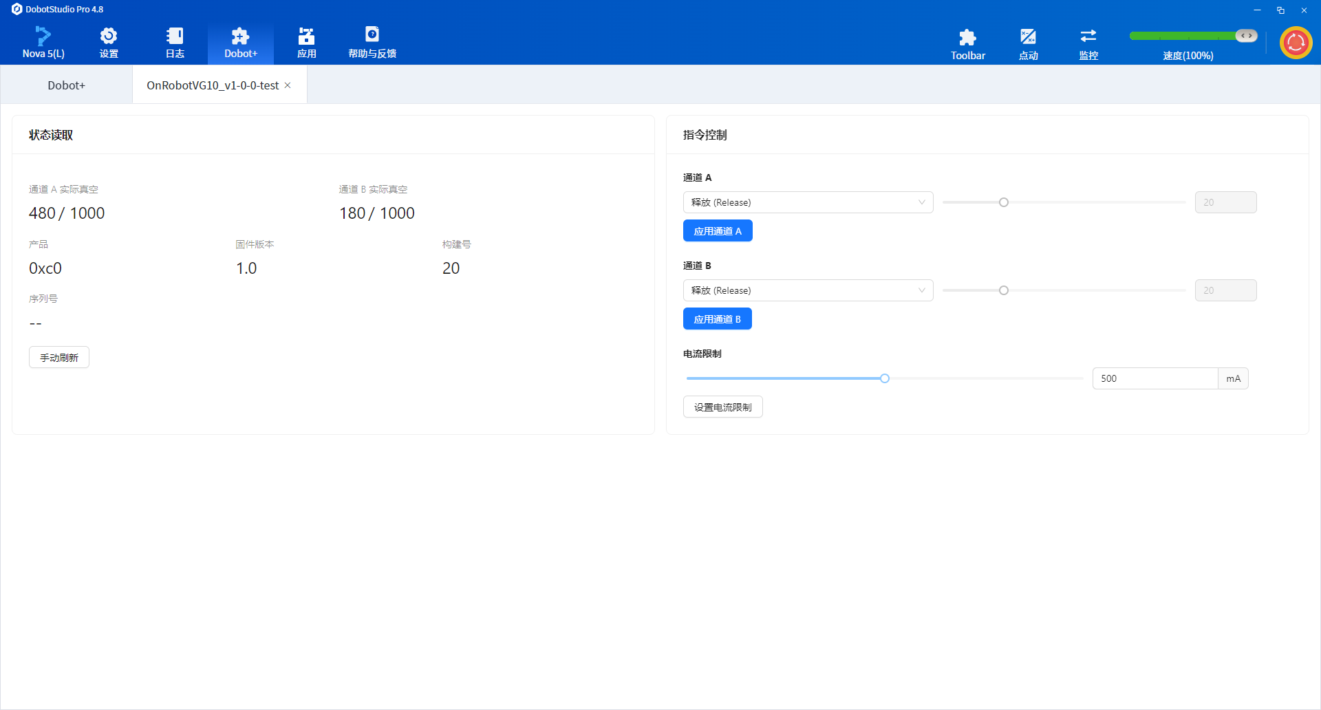
The screenshot below shows the OnRobot VG10 plugin: channel vacuum levels and product model on the left; vacuum grip parameters and grip/release controls on the right.
Do not change this layout rule in Requirements.md. Changing the left-right split to stacked layouts, multiple tabs, or other structures makes Agent behavior unstable and produces unpredictable pages.
Pages use antd as the base component library. You can reference the antd component library and specify UI types for each function in Requirements.md.
Specifying UI in Requirements.md
Add a UI interaction description line under each function. The Agent maps it to the ui field in function.json.
Recommended Format
Append a UI interaction description line under each function in Requirements.md.
For example, a set-speed function can be described as:
### SetSpeed — set speed

- Action: write speed register, range 0~100
- Parameter: speed (number, default 50)
- UI: Slider
When Requirements.md is written this way, the generated UI renders the set-speed function as a slider.
Function Type vs UI Mapping
| Function type | Typical naming | Suggested UI | Placement |
|---|---|---|---|
| No-parameter control | StartDevice, OpenGripper | Button | Right |
| Parameterized write | SetSpeed, SetForce | Slider / Input / Select | Right |
| Enum selection | SetMode, SetChannel | Select / Radio / Dropdown | Right |
| Boolean toggle | EnableVacuum | Switch / Checkbox | Right |
| Status read | GetStartStatus, GetPosition | Tag / Text / Table | Left |
| File operation | ImportConfig | Upload | Right |
Component Types
Display Components
Used in the left Device status area for read-only, no-input functions.
| Component | ui value | Use case | Requirements.md example |
|---|---|---|---|
| Read-only text | No fixed enum; Agent may use tag or Statistic | Single numeric or string status | UI: read-only text / UI: read-only status |
| Tag | tag | Boolean or enum status with color distinction | UI: Tag (1=running, 0=stopped) |
| Table | table | Multi-row, multi-field status list | UI: table showing channel status |
Control Components
Used in the right Control panel area. Parameterized functions render controls in the form; functions with ui: button are grouped in the bottom button area.
| Component | ui value | Use case | Requirements.md example |
|---|---|---|---|
| Input | input | Numeric or text parameter input | UI: input (range 0~255) |
| Slider | slider | Continuous value adjustment (speed, force, etc.) | UI: slider (0~100) |
| Select | select | Single choice from many options | UI: select (options: A / B / C) |
| Dropdown | dropdown | Dropdown menu selection | UI: Dropdown menu |
| Radio | radio | Few mutually exclusive options | UI: radio (on / off / auto) |
| Switch | switch | Boolean toggle | UI: switch |
| Checkbox | checkbox | Boolean checkbox | UI: checkbox |
| Button | button | No-parameter immediate action (start, stop, reset) | UI: button |
| Upload | upload | File import | UI: file upload |
Default Inference Rules
If a function description does not specify a UI type, the Agent infers from semantics and parameter types:
| Function characteristic | Default UI |
|---|---|
| No-parameter control / trigger | Button |
number parameter with a clear range | Slider |
number / string parameter without range or needing precise input | Input |
| Enum or limited options | Select or Radio |
boolean parameter | Switch |
| Read-only status returning boolean or discrete enum | Tag |
| Read-only status returning number / string | Read-only text (Statistic) |
| Multi-row structured data | Table |
Explicitly writing UI types in Requirements.md is recommended, especially for edge cases (e.g. "force as slider, mode as radio, status as Tag") to reduce mismatches.
Full Example Snippet
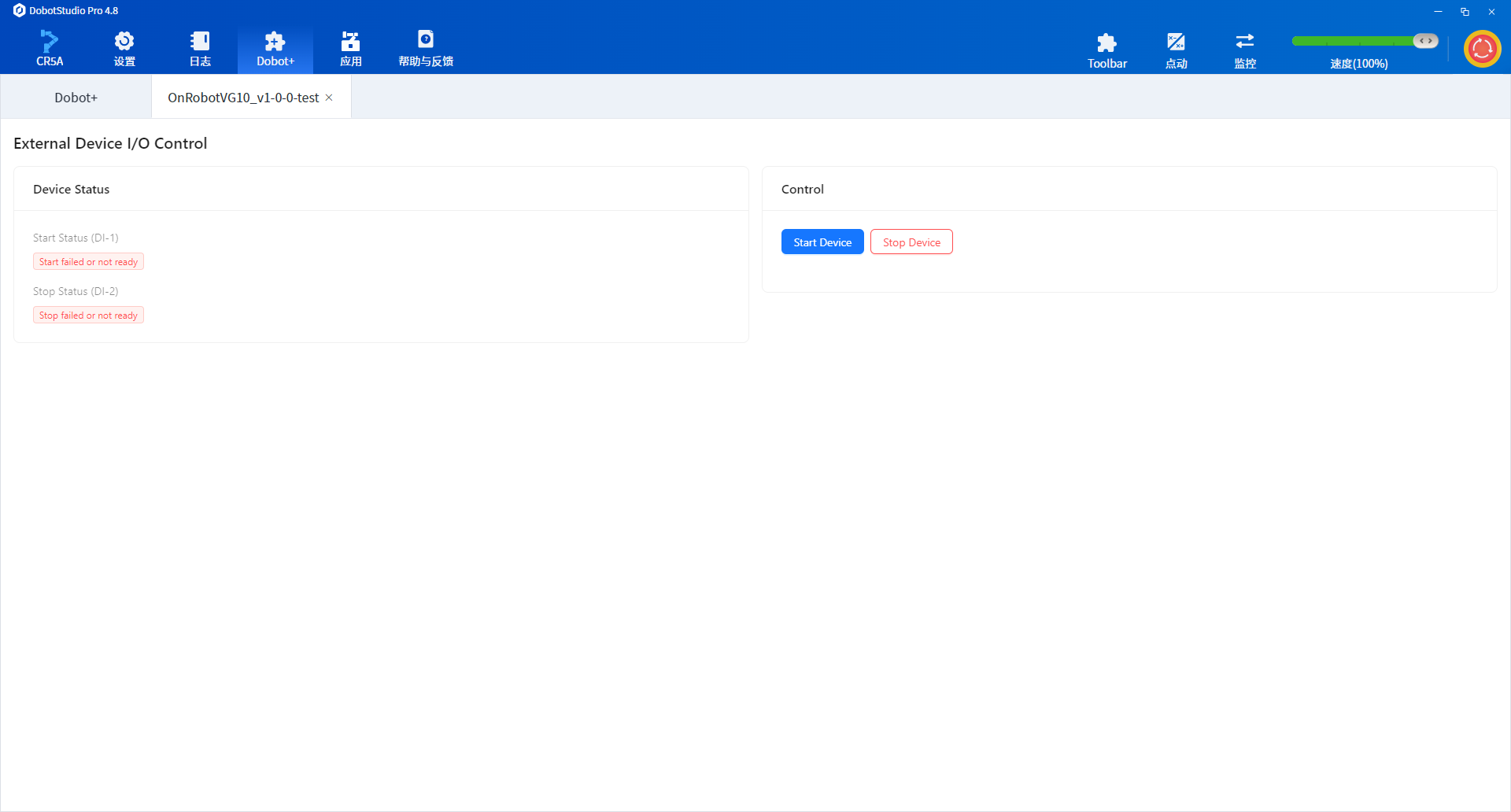
The following snippet is from the I/O control example, showing buttons paired with read-only status:
# I/O Control Example

> Send commands to an external device via controller digital outputs (DO) and read status via digital inputs (DI).

## 1. Device overview

This plugin controls an external processing device over controller I/O—no Modbus or TCP.

## 2. Communication method

| Item | Description |
| --- | --- |
| Protocol | Controller I/O |
| Output ports | DO (digital output) |
| Input ports | DI (digital input) |
| Lua API | `DO(index, ON\|OFF)`, `DI(index)`, `GetDO(index)` |

## 3. I/O ports

| Port | Direction | High level | Low level |
| --- | --- | --- | --- |
| DO-1 | Output | Start command | Idle / not started |
| DO-2 | Output | Stop command | Idle / not stopped |
| DI-1 | Input | Device started | Device not started |
| DI-2 | Input | Device stopped | Device not stopped |

## 4. Functions

### 4.1 StartDevice — start external device

- Action: `DO(1, ON)` — high level on DO-1
- UI: button

### 4.2 GetStartStatus — read start status

- Action: read `DI(1)`
- Return: `1` if DI-1 is high (started); `0` if not ready or failed
- UI: read-only status

### 4.3 StopDevice — stop external device

- Action: `DO(2, ON)` — high level on DO-2
- UI: button

### 4.4 GetStopStatus — read stop status

- Action: read `DI(2)`
- Return: `1` if DI-2 is high (stopped); `0` if not ready or failed
- UI: read-only status

## 5. Operation flow

### Start

1. Call `StartDevice` — DO-1 high
2. Wait for device response (1–3 s recommended)
3. Call `GetStartStatus` — confirm DI-1 is high

### Stop

1. Call `StopDevice` — DO-2 high
2. Wait for device response (1–3 s recommended)
3. Call `GetStopStatus` — confirm DI-2 is high

## 6. Safety notes

- Confirm DO wiring before operation to avoid unintended device triggers
- After stop command, confirm safe shutdown via DI feedback
- If DI stays low, check external device fault or wiring
Generated Result
After the Skill finishes, the UI looks like this:
FAQ
Manual build when Agent packaging fails
When development and debugging are complete, run from the project root:
dpt build
Outputs:
dist/— built plugin sources for inspectionoutput/— zip package named<plugin-name>-<version>.zipfor import
Generated UI component type does not match expectations
Add an explicit UI: line under the function in Requirements.md, remove ambiguous wording, and re-run /dobot-plus. For a single control tweak, edit ui/Main.tsx manually.
Buttons and parameter controls are misplaced
By convention, controls with ui: button render at the bottom of the right form; other control components render in the form field area. Do not request custom layout in Requirements.md.
Need custom components or complex pages
The current Skill targets standard Dobot+ plugin scenarios with the antd components and fixed left-right layout above. For complex interactions, manually rewrite ui/Main.tsx after /dobot-plus.